
UI DESIGN
UI & UX DESIGN
welcome to User Interface &
User Experience Design
I design game wireframes that map out clear player flows, intuitive HUDs, and responsive menus. My wireframes focus on usability, readability, and layout logic—laying the foundation for immersive gameplay experiences across platforms.

UI MINDMAP
USER EXPERIENCE

Order of Images for FTUE Flow for Crypto Dragon game


Order of Images for FTUE Flow for Crypto Dragon game
FIRST TIME USER EXPERIENCE
- 4X DRAGON GAME


FTUE FLOW OF A CCG GAME
The FTUE guides players through key mechanics—exploration, territory control, dragon growth, and resource use—via a story-driven tutorial. UI highlights, tooltips, and subtle prompts help players build nests, hatch dragons, and claim land, ensuring they understand the core loop within minutes.
The FTUE walks players through building their career from rookie to club player. It introduces club selection (like guilds), starter card packs, and lineup creation. The UI flow guides them step-by-step—joining a club, unlocking their first player cards, and customizing a team—culminating in their first competitive match. Tooltips and highlights keep onboarding fast, clear, and rewarding.

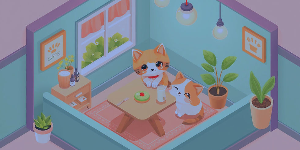
How do you transform a heartfelt story about Grandpa’s forgotten café and a few lost kittens… into an engaging idle tycoon game that onboards players intuitively — without relying on a single pop-up tutorial?
The goal: blend narrative, emotion, and interaction into a seamless FTUE (First-Time User Experience) that teaches through doing, not telling. Every UI element had to support story progression while gradually revealing core mechanics like serving, renovating, upgrading, and earning — all within a cozy, pet-filled world.

How do you design an intuitive, scalable inventory system for a top-down action game — when each weapon has 5 tiers of skins, and each skin includes multiple cosmetic effects, attachments, and upgrades?
In this project, inspired by Mighty Doom, I focused on solving for clarity within complexity. The system needed to handle:
-
Multiple weapon slots (primary, secondary, special)
-
Tiered skins with progression logic
-
Visual cosmetic customization (colors, effects)
-
Slot-based body armor UI (head, torso, legs, etc.)
All without overwhelming the player ??


MY APPROACH
-
Modular UI Panels: Each weapon and armor slot opens into a layered panel with tabbed views — allowing quick access to skins, effects, and stats.
-
Clear Tier Hierarchy: Color-coded and icon-based tier indicators to help players instantly recognize rarity and progression.
-
Inline Previews: Live 3D model preview slots for cosmetics, to reduce menu hopping and improve visual feedback.
-
Minimal Tap Depth: Designed interaction flow to keep essential actions within 2 taps, avoiding buried menus.
-
Consistency with Theme: UI art style, font weight, and button feedback were all tuned to match the gritty, mechanical feel of a top-down sci-fi shooter.
A complex inventory system doesn’t have to feel complex. By structuring layered customization into clear, visually rewarding flows, I turned an overwhelming array of upgrades into a system that feels collectible, intuitive, and satisfying — especially for fast-paced, loot-driven gameplay.


